Credit Card Recommendation Concept
Problem + Idea
In 2017, 75% of American consumers had at least one credit card. As this number continues to rise, complexities and options for credit cards also increase. After spending time looking for a new credit card, I found a lack of quantitative tools to help consumers looking for a new credit card. My goal for this concept was to create an experience that enables consumers to find a credit card optimized for their spending habits and lifestyle.
Summary
I set out to provide a solution that would help consumers navigate the crowded and convoluted space of credit card rewards. After performing research of my own and iterating through potential solutions, I decided on a direction that valued clear quantitative information for the consumer . I researched solutions that are currently available and decided that this experience would be best suited as a feature of the NerdWallet application. This feature would not only further NerdWallet's mission, but I also think that it would increase their user base and potentially their advertiser revenue.
Process
In this concept study, I applied the process below to inform my design decisions.

Research and Synthesis
Consumer and Industry Research
Are there any solutions currently out there?
Although I had done preliminary research while looking for a product to solve this problem, I decided to fully research all other solutions in the industry. There were three companies that offered some semblance of a solution. At the moment of research, none of them were comprehensive enough for my needs. NerdWallet had the best solution followed by Mint. I paired this research with asking consumers how they currently go about solving this problem.
- Nerd Wallet
- Mint
- Credit Karma
Who am I making this product for?
Although I wanted to build this experience to help all credit card users, I needed to start somewhere that would be profitable to the company building the experience as well as their client base. Working through my job stories and requirements, decided to focus on high reward cards for medium to high credit score individuals with unique spending needs.
Requirement Analysis and Job Stories
In what context do people start looking for a new rewards card? + What is their main motivation behind solving this problem?
Analyzing user research, I wanted to create an experience that could accommodate for as many of the scenarios leading to the problem as possible. I needed to analyze the context in which the problem was occurring as well as the motivation behind solving the problem.
Based on the research I conducted, I created these job stories (using the jobs to be done framework) to help guide the design decisions:
- When I have a big purchase coming up, I want to find a new credit card, so i can get the most rewards possible out of my purchase.
- When I need to build credit, I want to find a card that I will be accepted for, so that my credit score will go up.
- When I hear my friends talk about a new credit card, I want to learn more about that card, so that I can figure out if that card will help me earn more rewards than my current card.
- When I am going to travel, I want to find a reward card that doesn’t give me fees for exchanges, so that I am not wasting money on fees.
- When I want to increase my credit card rewards, I want to find the best reward card for my needs, so that I save the most money.
Ideation
Solution Brainstorming and Rating
After brainstorming multiple concepts, I ranked the concepts on two axis, impact (value to customer, reach, and potential revenue) vs implementation effort. The solution I arrived at takes in a user's financial data to get exact spending habits as well as their credit score. It then processes this data through an algorithm and returns list a of cards with actual reward values attached based on the user's historical spending data. The solution I arrived at offered maximum impact with moderate to high amount of engineering effort. I felt that this solution encompassed the context of the job stories as well as completing the user's end goal.
Requirements and Assumptions
The proposed solution requires a user to enter financial data as well as info to retrieve their credit score. After research into currently available solutions, I decided that this feature would be best added to NerdWallet's mobile application. The key inputs that enable this feature are:
- Credit card data
- Likelihood of getting a card depending on your credit score
- Card ratings
- Card benefits
- Personal Financial Data
- Credit card transactions
- Debit card transactions
At the moment, NerdWallet has all of these things except for credit card transactions. Mint is missing the breadth of credit card data that NerdWallet has. Credit Karma is missing financial data. I am going to continue this case study with the assumption that NerdWallet can and will add credit card transaction data to their application. (This shouldn’t be too much trouble to add since they already have debit transaction data)
Storyboarding and Task Development
After synthesizing my user research data into manageable jobs, I created a simple storyboard describing how a user might use this experience. From this storyboard, I was able to come up with a list of tasks that the user would be able to perform in the application. The tasks are as follows:
- Login to NerdWallet
- Link bank and credit card accounts
- View personalized reward card rankings by potential yearly reward value
- View ranked potential reward cards
- Apply for a card
- View card analysis + rewards breakdown
- View card ratings
- View card perks
- Wins above replacement of current card (dollar value breakdown + perk breakdown) perks could have estimated customer values to add to estimated dollar amount value
- Average approved score (possibly develop scoring system to give estimated approval percentage)
- Searchable field to find cards you heard about from friends
- Ability to favorite cards so you can compare
Ultimately, the goal of this feature is to give the user enough knowledge to comfortably decide on a new credit card and apply within the NerdWallet application.
Prototyping
Key Considerations
- How can we present the user with recommendation results in an accessible, readable and easily comparable format?
- How can we allow the user to customize input into our recommendation system in a simple manner?
- Although we will be allowing the user to change the input data, how can we make the experience simple and "magical" for the user?
- How can we present large amounts of comparative data on a relatively small mobile device screen?
Wireframing
Combining all of these pieces, I drew out a number of solutions that would fit within the NerdWallet application.

From these sketches, I made some greyscale wireframes to get feedback from potential users. Shown below are some of the wireframes for the card list screen.

Prototyping different ways to interperet the card list view

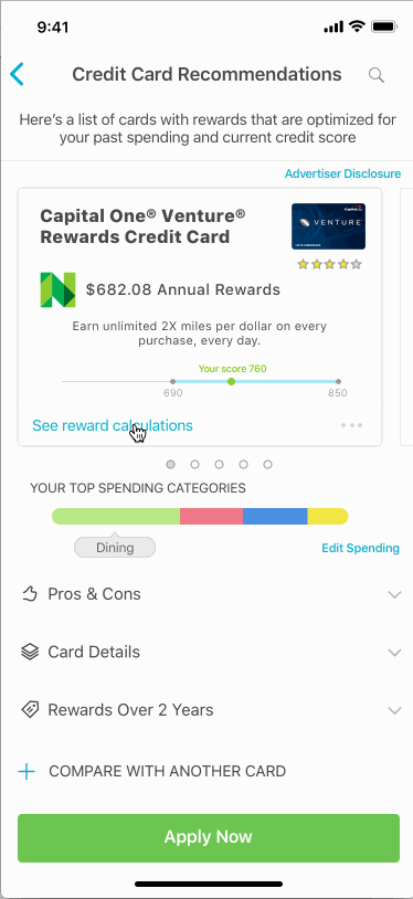
Personalized Ranked Card List
After getting feedback on the wireframe designs for the card list, I settled on a design with several key features:
- Easy ability to compare cards without tapping back and forth between screens.
- High visibility of potential reward value with the new card
- Large amount of information on the screen within one tap
- Ability to apply from the card listing screen
- Slight skeuomorphic "card" design influence, I wanted users to be able to feel like they were swiping through credit cards
I created an initial version of the card list screen. After showing the screen to users, I realized there were a couple of notable issues that I needed to correct.
- The spending customization button is confusing and somewhat hidden.
- The arrow denoting the spend calculations for annual rewards just looks like an indicator to swipe to the next card.
- I needed to emphasize how rewards are calculated on a personalized level
Key elements: I settled on using a horizontal scroll for the card list screen so the user could easily swipe through comparisons of their top card picks. The horizontal scroll also allows for more customization by enabling the user to collapse or expand information that they want to see in the drop downs. Reviewing feedback, I also moved the spending category to the top of the screen. Placing the spending bar in the middle broke up the elements that made up the horizontal scroll.
Search and Card Compare
After completing the main card list, I began building out the other user pain points highlighted in my research. I wanted to solve for the context in which users were finding the problem. I deliberated that two tasks, the ability to search cards and the ability to compare cards, would solve for the rest of the user's context for this feature.
These were specifically noted from learning what triggered a user to want to look for a new reward card. To meet these triggers, I added a search cards and compare cards feature to the app. These features enable users to look up cards (like if their friends were to suggest a card) as well as compare the recommended reward card to a current card that own.
Upcoming Purchases, and Edit Spending
Upcoming Purchases and Edit Spending were added to allow the user to influence the calculated annual rewards. This would also effect any minimum spend that the user might need to hit for a signing bonus on a new card. This met user criteria where the user would be looking for a new card because they would be able to hit minimum spend with upcoming purchases. It would also allow for the user to adjust inaccurate spending totals or account for future changes to their spending.

High Fidelity
Usability Flow
One of the more challenging aspects of adding features to the card list was figuring out how to give the user screen awareness. I wanted to refrain from using too many modals as well as stick to NerdWallet's design patterns for iOS. I added the Edit Spending screen as a presented modal from the bottom of the device. I chose for it to be presented rather than pushed because it was not a context sensitive screen. it should be accessible anywhere and anytime in the feature. I broke Reward Calculations as a separate screen that is pushed in from the right side. This is a context sensitive screen and changes depending on which card you access it from.
I decided to combine the search screen with the compare screen for two reasons. First, I want to minimize the design patterns a user experiences in the app, this increases the speed at which a user is able to process the presented information. Second, searching cards goes hand in hand with comparisons. By adding comparisons to the search result, it places all the tools at the user's convenience. Search and Comparison are both presented as pushed screens as they are context sensitive. Given the limited real estate on a mobile device, the comparison screen had to take a separate form. I opted for a familiar lateral swipe design that would give the user information on both cards at the same time.
Engineering Effort
Building on their current credit card recommendation system, NerdWallet wouldn't have too much front end development work to tackle. The most difficult engineering task in this case study would be architecting the data flow and calculations from credit card transactions and comparing them with credit card reward rates. Accounting for cycling categories during a financial quarter could also prove to be tough to tackle. Rather than having an estimated reward for each customer spend sector, these numbers would be calculated on an individual level. Whether this is calculated on the backend or something that could be done on-device would be determined by the existing architecture.
Business Impact
This feature has potential to increase newcomers to NerdWallet's platform by solving a complex problem. It also would benefit current NerdWallet customers. The feature would also increase advertiser funding as well as affiliate revenue. This feature enables users to have the most personalized credit card information available and also gives them the opportunity to apply for a card with that knowledge.
Measuring Success
We can measure success for this feature in several ways. First, we can look at the number of applications submitted through the credit card list. An increase in applications should show that the feature is working as intended. Another metric we could look at would be the variance of cards applied for. Say a month previous, we were seeing 50% Chase Sapphire Preferred applications but this month, that number increases by 30%. If this number correlates with users' Credit Card recommendation results, I think we could confidently determine the impact of this new feature. Finally, we could use anonymous user financial data to see if user's rewards went up after using this feature. This would be the real win, and further NerdWallet's goal.
What's Next
While this study is mostly core feature work, it could be expanded to much more and act as an AI for your credit card preferences. If I were to expand on this feature, I would begin working on the following extensions:
- Multiple Card Combos
- Wins above replacement vs. current credit card
- Ranked Perks - non-monetary rewards
- Probabliity of application approval
Shown below is an interactive prototype of the horizontal scroll. I created the prototype with Framer.